
Are business cards outdated? Not when they’re done right.
Especially in a place where your brand is often introduced before you even speak. For industries like film, fashion, beauty, real estate, and tech, personal image, hustle, and networking matter most. Particularly in big cities like Los Angeles.
Los Angeles is fast-paced, image-driven, and full of opportunity. From entertainment to startups to real estate, standing out means making an immediate and tangible impression. A well-designed business card can do just that if it reflects not only you, but also the style and values of the city you work in. So what makes a business card memorable and high-impact in LA’s competitive, design-savvy environment?
In LA, design isn’t one-size-fits-all. The details matter! Think foil accents, soft-touch finishes, minimalist layouts, bold colors, or luxury textures. Don’t just follow trends, that’s a great way to be out-of-style in a year or less. Anchor your design choices in your target neighborhood’s vibe:
Silver Lake: earthy, modern, design-forward
Beverly Hills: polished, glossy, glamorous
Venice Beach: relaxed, luxe, creative
Downtown LA: urban, contemporary, bold
Topanga: natural, grounded, wellness-oriented
Let your business card feel like it belongs in the environment you work and network in. They make an instant impression, feel intentional, and align with the recipient’s expectations. Here’s what consistently works across LA’s competitive industries:
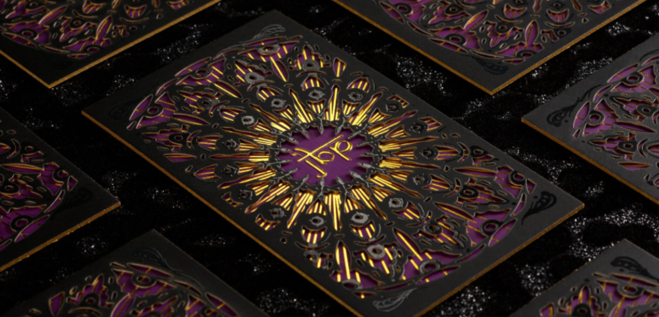
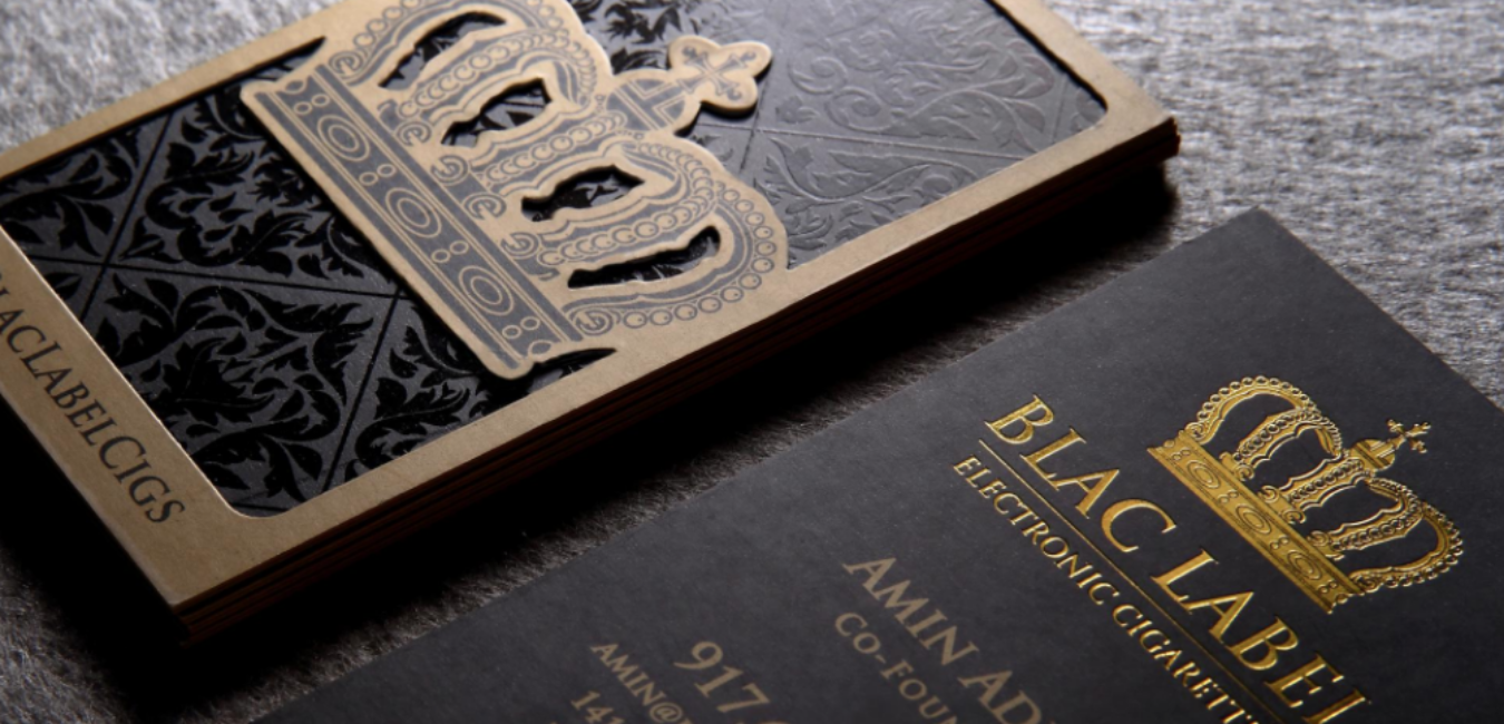
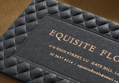
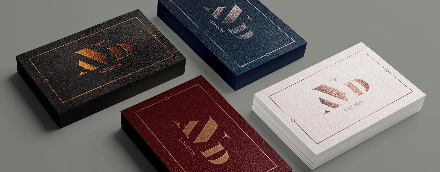
Cards That Feel Expensive (even if they’re not)
The tactile experience is crucial in LA. Soft-touch, ultra-thick cards (32PT or layered), embossed elements, or even velvet finishes make a business card feel premium. People often judge quality by the physical experience, not just design.
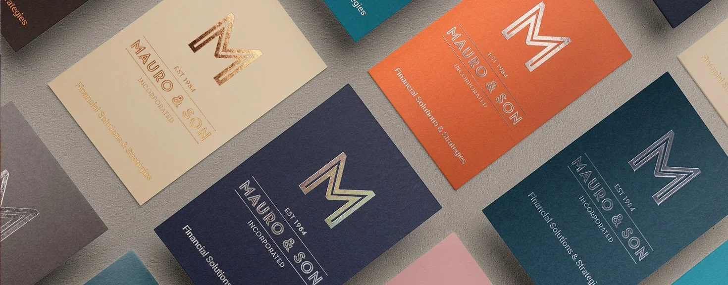
Simple, Strategic Design
There’s a reason why a clean layout always works. Focus on hierarchy (name, title, contact), a single bold element (highlighted with texture or foil).
Note: If you’re a real estate agent or creative, it may help to leave space to write a message to help your potential client remember what you spoke about during your time networking. White space is always your friend when it comes to design, but intentional white space for note-taking adds practicality.
→ Additional Tips:
Don’t let flashy finishes make your contact info hard to read. Luxury still needs clarity.
People in LA often value experience. Materials like suede lamination, embossed elements, multiple layers, or raised ink give your card a sensory edge.
Look for LA-based printers who specialize in high-end finishes! Local print shops often offer trend-forward options, they tend to understand the market better too.
Make every element count. If your Instagram handle or portfolio is your strongest asset, use it. Use QR codes to minimize the amount of real estate used for ugly, long-form links. It’s easy, and everyone knows how to use QR codes today. They’re even expected now, no need to add directions or overexplain how to scan them in your design (unless your target audience is much older.)
TLDR: Simplicity + personality win, especially over cluttered credentials.
QR Codes can lead to your portfolio, demo reel, or landing page. It can also open a direct email message to you, or be part of a larger advertising campaign. This works well across all industries (film, beauty, real estate, and tech).
→ Additional Tips:
Consider scannable text sizes: If someone’s taking a photo of your card to remember you, make sure all the text is legible.
Unless you’re in a traditional industry or have a brick-and-mortar business, you don’t need to put your address or slogan. And don’t even think about putting your fax number, unless it’s absolutely relevant to how people need to contact you.
Link to only ONE place! If you have multiple links, use a Linktree or another landing page to host all your links. And use your QR code to send them there. No one wants to read 10 lines. If you’re not using a QR code, then just put your phone, email, and IG (if relevant).
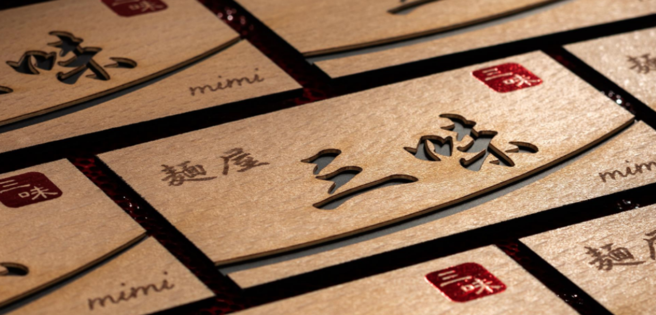
Your business card should reflect what you do and how you do it. The creative director in Venice Beach would have a business card that speaks understated luxury with high-contrast typography on textured black stock. A wellness coach in Topanga might choose recycled paper stocks with a soft earth-toned palette, while a tech founder would use clean lines, minimal text, and maybe a pop of color in a metallic accent for a touch of sophistication.
Film & Entertainment (Hollywood, Burbank)
Minimal, sleek, and modern. Matte black cards with embossed text, or using white or holographic foil to reflect creativity and confidence. These are ideal for producers, agents, or stylists.Fashion & Beauty (West Hollywood, Beverly Hills)
Soft-touch finishes with foil accents, blush tones, or bold typography. Luxe but not overdone. Think texture + clean glamour.Tech & Startups (Santa Monica, Culver City)
Crisp, modern layouts with QR codes linking to portfolios or product demos. Recycled paper or innovative materials (like stone or hemp) add a sustainable edge.Wellness & Lifestyle (Topanga, Venice)
Earthy tones, recycled kraft or cotton paper, debossing or letterpress. Cards here often feel like part of a curated brand experience.
Your niche isn’t just your job. It’s your style, and that’s what people remember.
→ Additional Tips:
Use typography that reflects your vibe. Bold, editorial styles for media, or clean sans serifs for tech. Be careful with script fonts, as many of them are overused on platforms like Canva.
Your color palette says more than you think. Warm tones feel inviting and organic. Bold contrasts feel like innovation and confidence.
Design for your networking context. If you’re handling these out at panels, pitch meetings, or trunk shows, keep your audience in mind.

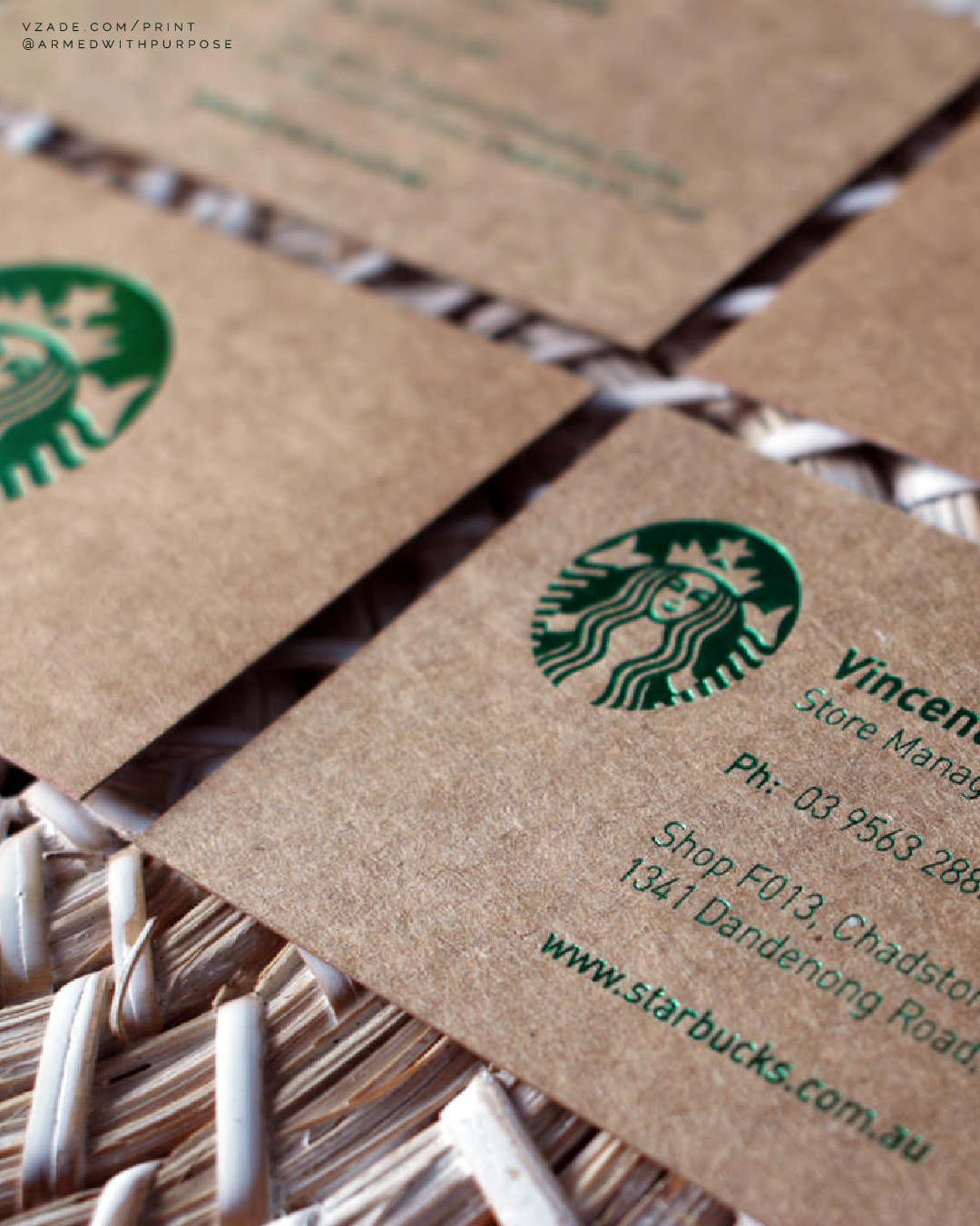
Eco-conscious design isn’t just a trend, it’s often an expectation. Recycled materials, plant-based inks, and plastic-free finishes can still look and feel premium. And they often stand out more.
Sustainability and luxury are no longer opposites, they’re part of the same modern standard. Especially in fields like wellness, clean beauty, fashion, interior design, and media. Instead, they’re drawn to the balance of visual sophistication with social responsibility. An eco-friendly card is expected in these spaces, and your audience will notice if your branding doesn’t align with your values.
Many LA clients judge quality based on how the card feels in hand. A tactile eco-friendly stock can leave a bigger impression than a heavy raised gloss spot UV. Instead of loudly advertising “eco-friendly” on your card (which can feel performative), let the card speak for itself though minimal design, high-quality sustainable materials, and expert craftsmanship.
Show your values without overwhelming your aesthetic.
→ Additional Tips:
Make your eco-friendly credentials visible, but not the main highlight. A tiny note like “Printed on FSC-certified stock” shows your values without distracting from the design.
Go minimalist with high-impact materials. A simple design on textured, recycled paper feels more luxurious than a cluttered glossy card.
Plastic alternatives like stone paper, hemp fiber, or bamboo stock are catching on. If you’re looking to stand out in faux-traditional ways and be sustainable, there’s also stock that mimics leather, animal skin, tree texture, and more.


KEEP READING:


